My approach for the assignments has been a partial rebrand of the product Spark Hedge’s image. My intention has been to modernize its look and create a system that connects Athena’s products to United Fintech visual universe.
My suggestion is to keep the overall look of the typography used in the original logo (futuristic and geometrical). End users are loyal to brands for specific reasons, and, as a result, they’ve come to expect consistency. I believe that a partial rebrand keeps the product’s user base and facilitates onboarding, as there is not a whole new story to tell but a continuation of that relationship.
In the branding of United Fintec the honeycomb plays a vital role. I have used the honeycomb as my inspiration for this renewed visual identity, using the grid to design the logo and other elements.
The Logo
Logo. With the letters of the new logo, I have tried to make it lighter, more dynamic, and sharper. They are also a bit more condensed, so the overall length of wording is shorter. There is an angulation, a cut, at one end of each letter to increase the sense of speed.
The premise for removing the star
The product Spark Hedge is manifested by the collaboration between Athena and the client, in this case, the Hedge Funds. So it’s essential to display that relationship visually. In my version of the logo, the light and color do not come from the star but from the client/product’s name, connecting the two elements.
Product Categories
For the “client/category” part of the logo, I have chosen a font called Mont, with a large family of different weights, from thin to very bold. This type can be used as a corporate font for the web and documents.
There are two ways of using a font online. Using a corporate font like Mont requires putting it in the servers, giving pixel-perfect results every time the font loads. There is also the embed font option, like similar Google fonts.
The Mont typeface is geometrical and a good counterpart for the characters of the renewed Spark logo. The PDF presentation uses Mont.
The name of the product is with Mont – Regular All Caps (LITE, HEDGE…)
Mont type family - Web/Print use
Backdrops for presentations and layouts
Video
Addressing decision-makers. Storylines
With the video, I want to target hedge fund managers by showing a complex world that Spark Hedge can help simplify. With an energetic, upbeat tone, I have also aimed at creating a piece that can attract younger top talent within the hedge fund structure. They can be the biggest supporters of new technologies within hedge funds, the first point of contact to onboard them.
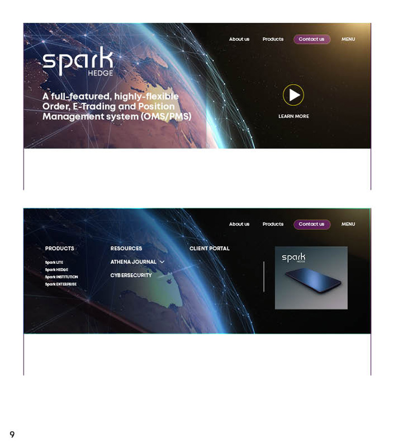
Product Landing page
Suggestions for usability and layout of the product’s page.
As I see it, one of the main tasks is to reduce the elements the user sees at first glance and group the information. Then, clearly present the main actions we want the user to take. Other options can be shown inside expandable windows and/or tabs.
For example, when clicking the word MENU on the main menu, it expands, covering 80% of the screen. This gives enough space to layout the inner menu items in a more visual way, allowing for more space. Hovering over one menu item activates an image or a video to the right, with a call to book a demo.